

What is Amparo?
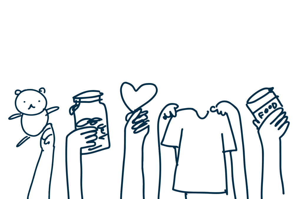
Amparo is an MVP for a donation website, developed during IDEO.org's “Introduction to Human-Centered Design” course in partnership with Acumen Academy. On this project, I worked in partnership with Bruna Stein, also a UX/UI Designer. I was responsible for overseeing the entire design process, including testing and designing the interfaces, while Bruna was more involved in the research and definition phases.
Improving the Donation System
The premise of HCD is to generate social impact in the places where the solutions are implemented. While researching the challenges faced in our region, we discovered an alarming situation: almost half the population of our state (Rio Grande do Sul) was suffering from food insecurity. This problem was aggravated by structural factors, such as poverty, and circumstantial ones, such as the COVID-19 pandemic (G1, 2022). Faced with this worrying scenario, we wanted to contribute in some way to alleviating this situation, and so the idea of creating a donation system was born.


Diving into Context
To understand how a donation system works and the challenges involved, we carried out secondary research. In parallel, we spoke to people who donate, work with donations (volunteers) and also those who receive donations. In addition, we visited a temporary hostel for homeless people in the city of Canoas/RS and volunteered for a day at the Food for Life project, which serves food to homeless people every Wednesday on the Conceição Viaduct in Porto Alegre/RS.


People who donate
Chossing causes
Choosing between various causes is a challenge, and personal identification and trust in institutions are important criteria. The most important causes for Brazilians are Fighting hunger and poverty (43%) and Helping children (19%).
Lack of feedback
Not receiving feedback or not knowing the impact of their donations can affect donors' motivation and confidence. In Brazil, 45 per cent of donors prefer to donate directly to people in need, without the intermediary of an institution.
People working with donations (volunteers)
Identifying needs
Knowing what people really need is not always an easy or obvious task. Not carrying out this task assertively also leads to distrust among donors, with 41% not trusting that the funds donated will be used correctly.
One-off and disproportionate collections
According to reports from volunteers and public authorities we spoke to, depending on the campaign, donations can be disproportionate or not meet real needs. This leads to problems such as storage, wastage and long-term insecurity for those who receive them, due to the lack of regularity.
Lack of concrete data
Often, data on campaigns and initiatives is not recorded or communicated effectively to donors. Only 45% of Brazilian donors believe that NGOs are transparent.
People who receive donations
Limited communication
Communication can be limited by various factors such as access to the internet or mobile phone, lack of dialogue with institutions or insecurity and stigma.
Dependence on regular donations
The lack of regular campaigns means that people who need recurring donations, such as those in situations of food insecurity, have to constantly adapt in order to have their basic needs met.
Restriction on donations
Some institutions may impose restrictions on the quantity and type of items donated, which may not meet individuals' basic needs. Some also, according to reports, don't help people living on the streets.


The main problems with...
How might we...
Reduce the insecurity of donating online?
1
5
Help identify and communicate needs?
Make it easier to choose a cause?
2
Improve communication about the destination and impact of donations?
4
Promote more fluid communication between the parties involved?


3
Based on the How Might We questions, we brainstormed in order to gain insights.
We then voted individually for the most innovative ideas (5 votes) and those with the greatest chance of success (5 votes), totalling 10 votes per person. We then discussed each idea and selected a few (3 votes each) to prioritise in the prototype.
The other ideas would be prototyped at a later date and one of the ideas was eliminated due to its technical complexity and the time available for implementation.


Selecting ideas
Before we started structuring the prototype, we wanted to understand what information users would consider relevant when donating online. To do this, we carried out a Card Sorting test with 7 participants on the Optimal Workshop platform.
We asked them to prioritise some information that we had identified as relevant during our research. The participants had to organise the cards from the information they thought was most important (score 1) to the information they considered least important (score 16).
1) Cause and target audience
2) Impact of donations
3) Description of the organisation
4) Real campaign photos
5) Accepted forms of donation
6) Presentation video
7) Contact
8) Data from previous campaigns
Prioritising with users (Card Sorting)
9) Tracking targets in real time
10) Location *¹
11) Accountability *¹
12) Institution check
13) Possibility of recurring donation
14) Social media *²
15) Suggested values *²
16) Rewards for donations
Here's the result:
*¹ ‘Localisation’ and ‘Accountability’ tied.
*² ‘Social networks’ and ‘Value suggestion’ tied.

Considering all the information gathered and insights generated, we began to explore on paper some ways of solving the challenge. We then organised the ideas into flows (site map) and wireframes.
Structuring the prototype
Site Map


Wireframes


Prototype


Testing and Adjustments


We chose six people to test the prototype, allowing them to navigate freely. During the test, we asked participants to explain their decisions in one-to-one conversations, lasting an average of 20 minutes per person.
After the test, we revised the Site Map to incorporate insights and adjustments suggested by users, as well as refining components that caused confusion and hindered usability.
Refined Site Map


Refining components and elements
No participants clicked on the ‘I need help’ button
When we asked why, they said it was because they didn't need help navigating the site. However, we had designed this button so that, in case of need, they could ask for a donation. To do this, we made a change to the text.


Intuitive card, but not so much...
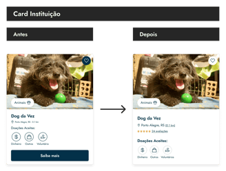
Some participants understood the icons in the ‘Donations Accepted’ section as buttons. However, none of the interviewees clicked on ‘Learn more’, intuitively understanding that the entire area of the card was clickable. We therefore decided to remove the button and soften the edges of the icons so that the stroke didn't have the same weight as the other buttons on the website.

Confusing and redundant sections
The ‘Help in any way you like’ section ended up being confusing and redundant for the test participants. However, the ‘Choose a cause’ and ‘Institutions in the neighbourhood’ sections were well accepted. In view of this, we eliminated the confusing section and left the other two together, without the information sections between them.


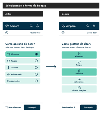
In the ‘I Want to Donate’ flow, the radio button was not well accepted
This was because the majority of respondents wanted to donate in different ways and filter the results from the start of the flow according to their interests. For this reason, we removed the radio button and allowed users to select more ways to donate.

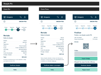
Refining the checkout for cash donations
For the cash checkout, the confirmation page included an animation, but for Pix payment method, it was necessary to create an additional page with information from the QR Code. There were also doubts about which elements to click on to return and carry out other actions, leading to considerations such as changing colours in the tracking bar to avoid confusion, and the decision to revise the flow.

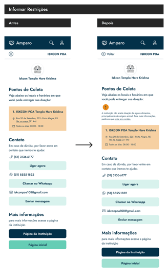
Inform Restrictions
To improve the user experience, we have implemented the suggestion of clearly stating which items are not accepted as donations, providing transparency and facilitating the contribution process.

The first time I came into contact with design was watching that famous IDEO video in which they rethought a supermarket trolley in five days. I then read the book Change by Design by the company's CEO, Tim Brown, which in Brazil came out under the title ‘Design Thinking’. IDEO's way of approaching and solving problems has always inspired me and being able to take a course designed by them, solving a problem in my city, was very rewarding.
Of the things I learnt during this course and project, I believe the most important is: always approach a project with the mind of a beginner. Even if you (think) you know a lot about a subject, you can always learn something new and most of the time this learning comes straight from the source, by talking to the people who live what you are investigating. It's about designing for people and with people.
Learnings
Links


